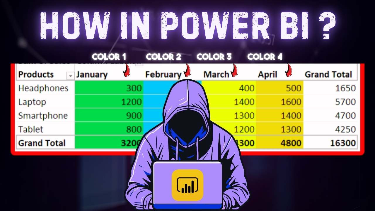
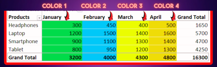
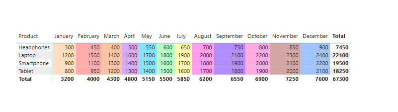
While working on a project which revolved around migrating a suite of excel reports and creating an exact replica of the reports in Power BI. During this project I came accross a report which needed a dynamic color coding for individual column of a grid, something like below…
Although Power BI does offer some conditional formatting options, there is no direct way to achieve this by default. So after researching I found an excellent way of achieving this in Power BI matrix visual. If you are interested then keep reading!
Why Apply Color Coding?
Adding dynamic color coding to your Power BI visuals can greatly enhance the storytelling aspect of your data. It allows viewers to quickly identify patterns, trends, and outliers in a visually intuitive way. In this blog, we’ll explore how to assign custom colors to each month dynamically and apply these colors to individual columns in your visuals. The data used in this example includes columns: Date, Month, Product, Quantity, and Sales.
Step 1: Lets Import the Data
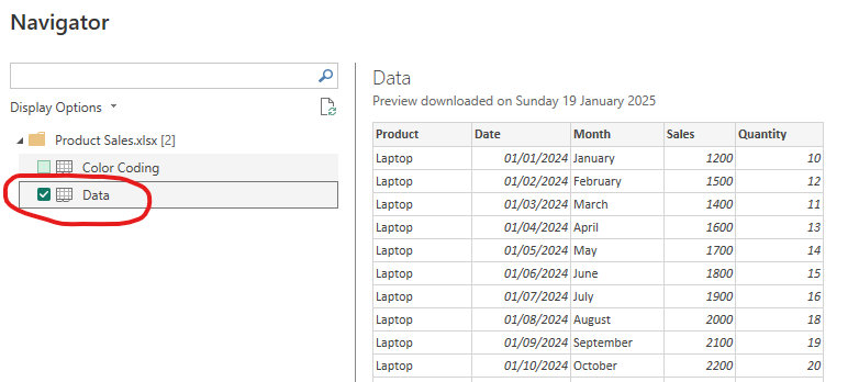
The first step is obviously to import the data into Power BI. You can click on the download button above to download the data, which is in an excel format. So open a new power bi file and on the first page click on EXCEL WORKBOOK. After this browse the data and import into power bi. While importing, just select Data and select LOAD

Step 2: Create a DAX Calculated Column, to help in Color Coding
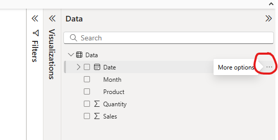
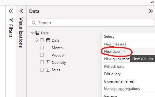
In Power BI we have couple of options to color code a grid or matrix visual. However by default it does not offer the ability to apply different color on individual columns. So in order to achieve this, we need a helper color which will tell us which column should have which color. So click on the 3 dots icon on the table and select NEW COLUMN
Now enter below DAX code into the formula bar and press the tick icon or press enter.
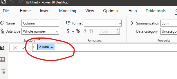
Month_Color =
    SWITCH(
        TRUE(),
        Data[Month] = "January", "#FFDDC1",
        Data[Month] = "February", "#FFABAB",
        Data[Month] = "March", "#FFC3A0",
        Data[Month] = "April", "#D5AAFF",
        Data[Month] = "May", "#85E3FF",
        Data[Month] = "June", "#B9FBC0",
        Data[Month] = "July", "#FBFFB1",
        Data[Month] = "August", "#FF9CEE",
        Data[Month] = "September", "#B28DFF",
        Data[Month] = "October", "#FFABE1",
        Data[Month] = "November", "#D4A5A5",
        Data[Month] = "December", "#A0C4FF"
    )
This calculated column assigns a unique hex color code to each month. You can adjust the color codes to suit your preferences or requirements.
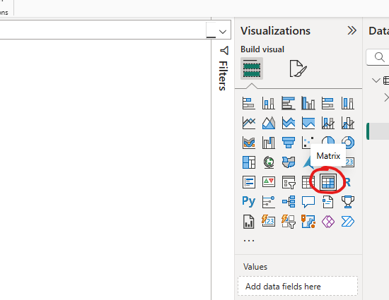
Step 3: Insert a Matrix grid visual into the Report view
Choose Matrix visual from the visualization pane and then choose below columns in the respective sections
- Product – Rows
- Month – Columns
- Sales – Values
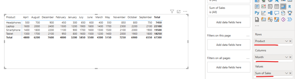
After creating the grid you might notice that months are not in order. This is because Month column is a TEXT column and it does not recognize it as months. So we need to sort the Month column based on the Date column. We can do this by following below steps
- Select Month column from the right side DATA panel
- In the Column Tool in the Toolbar, select SORT BY >> DATE
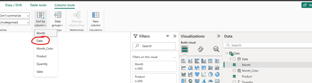
This will rectify the sorting and place all months in the correct order.
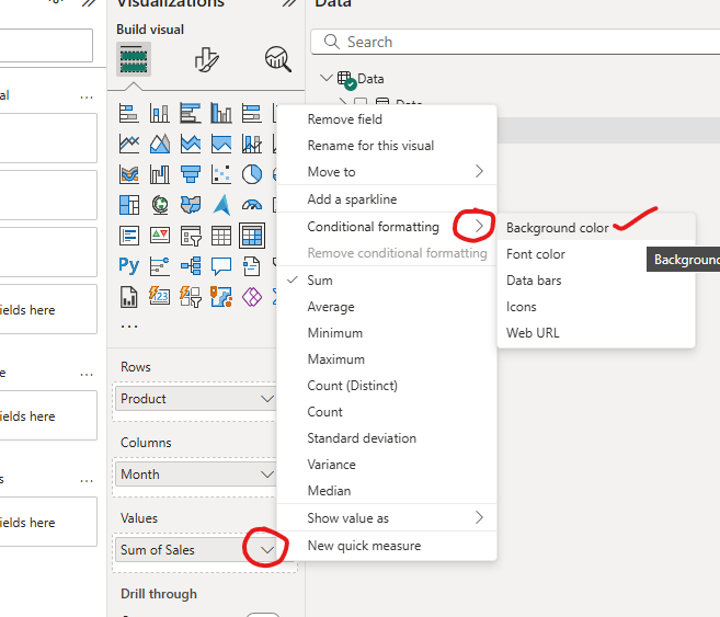
Step 4: Apply Dynamic Color Coding using CELL ELEMENT properties
Now for the final steps we will use the custom dax column and Cell Element property for coloring each month individually.
- Click on the Drop down in the Sales metric and Choose Conditional Formatting & then Background Color
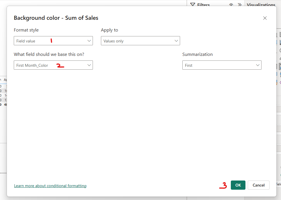
- In the next pop up window, Set Format Style as “Field Value”
- Select the new color coding Dax column that we created in the “What field should we based this on section” i.e. Month_Color column
- Keep everthing else as default and press OK
Alternative Method to Reach the Same Conditional Formatting Window
Power BI recently introduced the Cell Element formatting option, which offers even greater customization for table and matrix visuals. You can use this feature to:
- Highlight specific columns with dynamic colors.
- Add icons, borders, or other design elements for better data storytelling.
To use the Cell Element option:
- Navigate to the “Format” pane.
- Expand the “Cell elements” section.
- Assign the
Month_Colorcolumn as the background color source for the desired column.
Congratulations, you have now successfully colored each column of the Matrix grid individually. Now if you want, you can further enhance this visual by formatting the headers, number formats and other attributes of the Matrix visual.
Other Useful Use Cases
1. Performance Tracking by Categories
Use Case: Assign colors to performance categories like “Excellent,” “Good,” “Average,” and “Poor” to visually differentiate performance metrics.
Performance_Color =
    SWITCH(
        TRUE(),
        Data[Performance] = "Excellent", "#4CAF50",
        Data[Performance] = "Good", "#8BC34A",
        Data[Performance] = "Average", "#FFC107",
        Data[Performance] = "Poor", "#F44336"
    )
2. Highlighting Targets vs. Achievements
Use Case: Assign colors to highlight whether a sales target has been achieved or missed.
Target_Color =
    SWITCH(
        TRUE(),
        Data[Sales] >= Data[Target], "#B9FBC0",  // Green for achieved
        Data[Sales] < Data[Target], "#FFABAB"   // Red for missed
    )
3. Product or Category Segmentation
Use Case: Assign specific colors to different product categories or segments to create distinct groupings.
Category_Color =
    SWITCH(
        TRUE(),
        Data[Product_Category] = "Electronics", "#85E3FF",
        Data[Product_Category] = "Furniture", "#FFC3A0",
        Data[Product_Category] = "Clothing", "#FF9CEE",
        Data[Product_Category] = "Home Decor", "#D5AAFF"
    )
4. Risk Assessment and Management
Use Case: Use color-coding to highlight risk levels in a project or operational data.
Risk_Color =
    SWITCH(
        TRUE(),
        Data[Risk_Level] = "High", "#FFABAB",
        Data[Risk_Level] = "Medium", "#FFC107",
        Data[Risk_Level] = "Low", "#B9FBC0"
    )
These use cases illustrate the versatility of dynamic color coding. You can easily adapt this method to different scenarios to create visually impactful and actionable reports. Let me know which one you’d like more details on!
Conclusion
Dynamic color coding is a powerful technique to make your Power BI reports more interactive and user-friendly. By leveraging DAX calculated columns and conditional formatting, you can create visually engaging reports that tell a story at a glance.
Have you tried dynamic color coding in your Power BI reports? Let us know your favorite use cases in the comments below!