Introduction
Have you ever wondered which of your customers are your most valuable, and which ones you might be losing? Businesses collect tons of sales data, but the real challenge is making sense of it to drive growth. That’s where RFM analysis comes in.
In this article, I’m going to walk you step by step through building a customer segmentation dashboard using RFM analysis. We’ll take raw sales data, calculate Recency, Frequency, and Monetary value, and then group customers into meaningful segments like Champions, Loyal Customers, and At Risk.
By the end of this article, you’ll not only understand how RFM analysis works, but also how to design an interactive dashboard that gives you powerful insights into customer behavior.
What is RFM?
RFM stands for Recency, Frequency, and Monetary.
- Recency — how recently a customer purchased (more recent = more engaged).
- Frequency — how often they buy (more purchases = more loyal).
- Monetary — how much they spend (higher spend = higher value).
Together these three numbers let you rank customers — for example, recent, frequent, high-spend customers are ‘Champions’, while long-absent, low-spend customers are ‘At Risk’.
Data Overview
Before we can calculate RFM metrics, let’s quickly look at the dataset we’ll be using. This is a transactional sales dataset that records every order placed by customers. It includes important details like Order Date, Ship Date, Customer Name, Segment, Region, Product, Sales, Quantity, Discount, and Profit.
Now, for RFM analysis, the most important fields are:
- Customer ID or Customer Name — to group transactions at the customer level.
- Order Date — to calculate how recently a customer has purchased.
- Order ID — to count how many times a customer has purchased.
- Sales — to measure the monetary value each customer brings in.
While the raw data is at the transaction level, we’ll need to aggregate it at the customer level. That means for each customer, we’ll find:
- Their most recent purchase date,
- The total number of orders they’ve placed,
- And the total amount of sales they’ve contributed.
Once we have this summarized view, we’ll be ready to move into calculating RFM scores for each customer. This transformation is what turns raw sales data into actionable customer insights.
Data Preparation
- Load the data into Power BI using Text/CSV method
- Create a reference date DAX measure (optional)
Step 1 – Load the data into Power BI using Text/CSV method
Step 2 – Create a reference date DAX measure (optional)
To calculate recency, we need a reference point, usually the most recent date in the dataset. Here I’ve created a measure called MaxOrderDate that captures the latest order date in our sales table.
MaxOrderDate = MAX('Sales'[Order Date])Step 3 – Create Recency, Frequency, Monetary Table
Go to modelling tab & click on New Table. Then enter below DAX. This will create a new table named RFM_Calculation.
For each customer, it calculates three things:
Recency: the number of days since their most recent purchase,
Frequency: the number of distinct orders they’ve placed,
Monetary: the total sales value from that customer.
RFM_Calculation =
 SUMMARIZE(
    'Superstore 2025',
    'Superstore 2025'[Customer ID],
    'Superstore 2025'[Customer Name],
    "Recency", DATEDIFF(
        CALCULATE(MAX('Superstore 2025'[Order Date])),
        CALCULATE(MAX('Superstore 2025'[Order Date]), ALL('Superstore 2025')), DAY),
    "Frequency", DISTINCTCOUNT('Superstore 2025'[Order ID]),
    "Monetary", SUM('Superstore 2025'[Sales]))
Step 4 – Create a Date Table for usage in data modelling later on
DateTable =
ADDCOLUMNS (
    CALENDAR (DATE(2021,1,1), DATE(2025,12,31)),  -- adjust start and end dates
    "Year", YEAR([Date]),
    "Month Number", MONTH([Date]),
    "Month Name", FORMAT([Date], "MMMM"),
    "Year-Month", FORMAT([Date], "YYYY-MM"),
    "Quarter", "Q" & FORMAT([Date], "Q"),
    "Day", DAY([Date]),
    "Day of Week", WEEKDAY([Date], 2),   -- 1 = Sunday start, 2 = Monday start
    "Day Name", FORMAT([Date], "dddd"),
    "Week Number", WEEKNUM([Date], 2)
)
RFM Scoring in Power BI
Now that we’ve calculated Recency, Frequency, and Monetary values for each customer, the next step is to assign scores/rank. We usually use a scale from 1 to 5, where 1 is the best and 5 is the weakest.
But Why are we doing this? Because a customer with Recency = 30 days, Frequency = 5, and Monetary = 2,000 is hard to compare directly with others. By converting these values into a 1–5 scale, we can easily rank customers and group them into segments.
Step 5 – Add calculated columns for Recency_Score, Frequency_Score & Monetary_Score to RFM_Calculation table
Recency_Score =
 var RankRecency =
   RANKX(
      ALL(RFM_Calculation),
      RFM_Calculation[Recency],,ASC)

 var TotalCust = COUNTROWS(ALL(RFM_Calculation))
 RETURN
 CEILING(DIVIDE(RankRecency * 5, TotalCust),1)
Frequency_Score =
VAR RankFreq =
RANKX(
ALL(RFM_Calculation),
RFM_Calculation[Frequency],,DESC
)
VAR TotalCust = COUNTROWS(ALL(RFM_Calculation))
RETURN
CEILING(DIVIDE(RankFreq * 5, TotalCust),1)Monetary_Score =
VAR RankMon =
RANKX (
ALL ( RFM_Calculation ),
RFM_Calculation[Monetary],
,
DESC
)
VAR TotalCust = COUNTROWS ( ALL ( RFM_Calculation ) )
RETURN
CEILING ( DIVIDE ( RankMon * 5, TotalCust ), 1 )Customer Segmentation
Now that we have Recency, Frequency, and Monetary scores for each customer, it’s time to bring them together to form meaningful customer segments. Let’s build a calculated column in your RFM_Calculation table that assigns each customer into a segment based on their R, F, and M scores.
Customer_Segment =
SWITCH (
    TRUE (),
    -- Champions: best across recency, frequency, and monetary
    RFM_Calculation[Recency_Score] <= 2 &&
    RFM_Calculation[Frequency_Score] <= 2 &&
    RFM_Calculation[Monetary_Score] <= 2, "Champions",

    -- Loyal Customers: frequent buyers, fairly recent
    RFM_Calculation[Frequency_Score] <= 2 &&
    RFM_Calculation[Recency_Score] <= 3, "Loyal Customers",

    -- Big Spenders: high monetary value, but not recent
    RFM_Calculation[Monetary_Score] <= 2 &&
    RFM_Calculation[Recency_Score] >= 3, "Big Spenders",

    -- At Risk: were good before, but haven’t purchased recently
    RFM_Calculation[Recency_Score] >= 3 &&
    RFM_Calculation[Frequency_Score] <= 3, "At Risk",

    -- Lost: weak in all 3 metrics
    RFM_Calculation[Recency_Score] = 5 &&
    RFM_Calculation[Frequency_Score] = 5 &&
    RFM_Calculation[Monetary_Score] = 5, "Lost",

    -- Default bucket
    "Others"
)
DAX Measures before Building the Dashboard
Total Customers = DISTINCTCOUNT('Superstore 2025'[Customer ID])
Total Sales = SUM('Superstore 2025'[Sales])
AvgRecency = AVERAGE(RFM_Calculation[Recency])
AvgFrequency = AVERAGE(RFM_Calculation[Frequency])
AvgMonetary = AVERAGE(RFM_Calculation[Monetary])


YoY FrequencyVar =
 VAR LY = CALCULATE([AvgFrequency], SAMEPERIODLASTYEAR(DateTable[Date]))
 VAR LYFormatted = FORMAT(LY, "#,0")
 var yoyCalc = DIVIDE(([AvgFrequency] - LY) , LY)
 var yoyCalcFormatted = FORMAT(yoyCalc,"0.0%;(0.0%)")

RETURN
 SWITCH(
    True(),
    yoyCalc >0, UNICHAR(9650) & " " & yoyCalcFormatted & " | LY " & LYFormatted,
    ISBLANK(LY), UNICHAR(8211) & " | No Data for Last Year ",


    UNICHAR(9660) & " " & yoyCalcFormatted  & " | LY " & LYFormatted
 )


YoY MonetaryVar =
 VAR LY = CALCULATE([AvgMonetary], SAMEPERIODLASTYEAR(DateTable[Date]))
 VAR LYFormatted = FORMAT(LY/1000, "$#,0.00") & "K"
 var yoyCalc = DIVIDE(([AvgMonetary] - LY) , LY)
 var yoyCalcFormatted = FORMAT(yoyCalc,"0.0%;(0.0%)")

RETURN
 SWITCH(
    True(),
    yoyCalc >0, UNICHAR(9650) & " " & yoyCalcFormatted & " | LY " & LYFormatted,
    ISBLANK(LY), UNICHAR(8211) & " | No Data for Last Year ",


    UNICHAR(9660) & " " & yoyCalcFormatted  & " | LY " & LYFormatted
 )

YoY RecencyVar =
 VAR LY = CALCULATE([AvgRecency], SAMEPERIODLASTYEAR(DateTable[Date]))
 VAR LYFormatted = FORMAT(LY, "#,0")
 var yoyCalc = DIVIDE(([AvgRecency] - LY) , LY)
 var yoyCalcFormatted = FORMAT(yoyCalc,"0.0%;(0.0%)")

RETURN
 SWITCH(
    True(),
    yoyCalc >0, UNICHAR(9650) & " " & yoyCalcFormatted & " | LY " & LYFormatted,
    ISBLANK(LY), UNICHAR(8211) & " | No Data for Last Year ",


    UNICHAR(9660) & " " & yoyCalcFormatted  & " | LY " & LYFormatted
 )
YoY SalesVariance =
 VAR LY = CALCULATE([Total Sales], SAMEPERIODLASTYEAR(DateTable[Date]))
 VAR LYFormatted = FORMAT(LY/1000, "$#,0") & "K"
 VAR yoyCalc = DIVIDE([Total Sales] - LY, LY)
 VAR yoyCalcFormatted = FORMAT(yoyCalc, "0.0%; (0.0%)")

 RETURN
  SWITCH(
    TRUE(),
    yoyCalc > 0, UNICHAR(9650) & " " & yoyCalcFormatted & " | LY " & LYFormatted,
    ISBLANK(LY), UNICHAR(8211) & " | No Data for Last Year",
    yoyCalc = 0, UNICHAR(8211) & " | No Change from Last Year",
    UNICHAR(9660) & " " & yoyCalcFormatted & " | LY " & LYFormatted)


FrequencyYoYColor =
 VAR LY = CALCULATE([AvgFrequency],SAMEPERIODLASTYEAR(DateTable[Date]))
 VAR YOY = DIVIDE([AvgFrequency] - LY ,LY)
RETURN
 SWITCH(TRUE(),
    YOY > 0, "#00B200",
    OR(ISBLANK(LY), LY=0),"Orange", "#FF0000")

monetaryYoYColor =
 VAR LY = CALCULATE([AvgMonetary],SAMEPERIODLASTYEAR(DateTable[Date]))
 VAR YOY = DIVIDE([AvgMonetary] - LY ,LY)
RETURN
 SWITCH(TRUE(),
    YOY > 0, "#00B200",
    OR(ISBLANK(LY),LY=0),"Orange", "#FF0000")

recencyYoYColor =
 VAR LY = CALCULATE([AvgRecency],SAMEPERIODLASTYEAR(DateTable[Date]))
 VAR YOY = DIVIDE([AvgRecency] - LY ,LY)
RETURN
 SWITCH(TRUE(),
    YOY > 0, "#00B200",
    OR(ISBLANK(LY), LY = 0),"Orange", "#FF0000")


salesYoYColor =
 VAR LY = CALCULATE([Total Sales], SAMEPERIODLASTYEAR(DateTable[Date]))
 VAR YOY = DIVIDE([Total Sales] - LY, LY)

 RETURN
  SWITCH(TRUE(),
    YOY > 0, "#00B200",
    OR(ISBLANK(LY),LY=0), "Orange", "#FF0000")
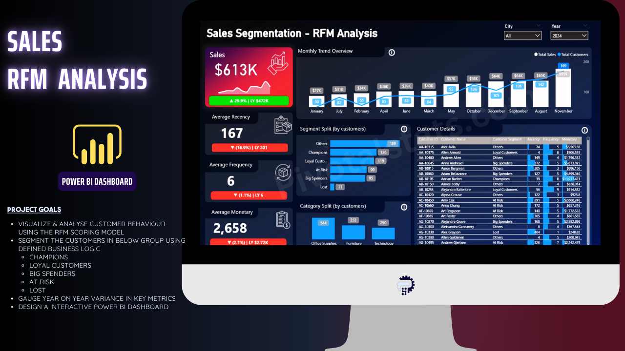
Building the RFM Dashboard in Power BI
Now that we’ve created the RFM scores and assigned customer segments, it’s time to bring this analysis to life with a Power BI dashboard. Remember, the whole point of this exercise isn’t just to crunch numbers — it’s to visualize customer behavior so that businesses can take action.
You can watch below video where I explain each & every formatting steps to create this dashboard
At this stage, we’ve turned raw transaction data into a strategic tool. The RFM dashboard doesn’t just show who bought what, it shows who your best customers are, who might churn, and where to focus your marketing campaigns.
Hope this blog & tutorial was helpful. Subscribe & stay tuned for more such interesting contents!