The process of creating a dashboard in Power BI consist of following steps:
- Requirement Gathering
- Data Collection
- Data Transformation & Modelling
- Data Visualization Blueprint
- Dashboard Layout & Design
- Adding Interactivity & Navigation
- Testing
- Sharing
- Maintenance & Routine Refresh
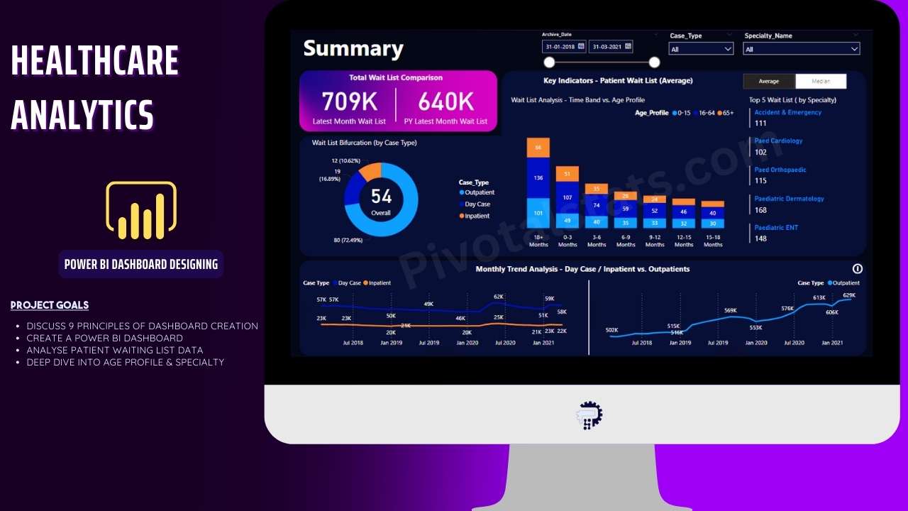
Now lets see all of these steps in detail and develop a Power BI dashboard from scratch. For this exercise we will be using publicly available Healthcare data about the Patient Waiting List.
You can download the resources used in this entire process from the below link:
#1 Requirement Gathering
Identify Stakeholders –
Determine primary stakeholder and establish a point of contact who might be the domain experts or leaders who will eventually use the dashboard
Understand Business Objectives –
Through meetings and calls with stakeholders you should get an outline of Goals from the entire endeavor. Asking open ended questions will help you gain more insights to understand the data and how this dashboard will help achieve a specific business goal.
High Level Data Study –
A high level overview of data is required before you initiate discussions around scope, metrics and other granular topics. So here we will try to understand the data in terms of:
- Data Sources
- Column Description
- Data Type
- Volume and frequency
- Data Quality – Missing Values or Anomalies
Define Scope –
This is the perfect stage to discuss Key Metrics, KPIs & Deployment Timelines. Document the calculations, time frames & scope which will help in setting the expectations and avoiding any future disagreements. Also as a best practice remember to keep a 20% buffer while finalizing deadlines because it’s always better to over deliver after a standard commitment than to underdeliver after an extraordinary delivery pitch.
What is the problem statement for this exercise?
Overall Objective
- Track current status of patient waiting list
- Analyze historical monthly trend of waiting list in Inpatient & Outpatient categories
- Detailed specialty level & age profile analysis
Data Scope
2018 – 2021
Metrics
- Average & Median Waiting List
- Current Total Wait List
View
- Summary Page
- Detailed Page for Granular Analysis
#2 Data Collection
There are over 200 different data connectors available to collect data inside power bi, but below are the most widely used connectors:
- Excel / CSV
- Folder Connection
- SQL Server or Any database
- Power BI services
- Cloud Platforms – Azure, AWS, GCP etc.
- ERP Systems – Salesforce, SAP etc.
- Sharepoint
- Web or JSON
This is the stage where you decide the source of your data. This step is very important because this will also define how you are going to refresh the dashboard after deploying the solution. For today’s example we are going to use a central folder which will host all the files required for the dashboard refresh process.
I’m going to download the zip file from the above download button and extract the file inside a new folder on my desktop. This will act as my data repository going forward.
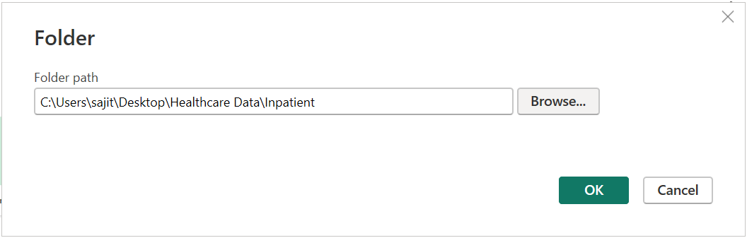
How to import data into Power BI using a folder connector?
- Open Power BI desktop and click on GET DATA and select FOLDER option. Click Connect button at the bottom right
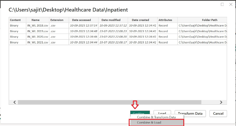
- Now browse the folder path where we have stored Inpatient data and press OK
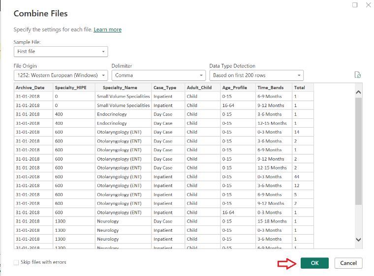
- The next prompt will show you the files available in the folder path. Then click on Combine button and select Combine & Load
- Next popup window will show you a preview of the data. If everything looks good then click on Ok
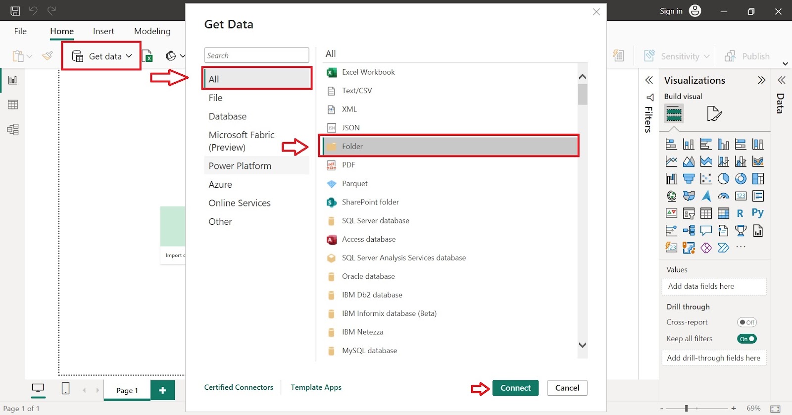
Now repeat these 4 steps again for loading the Outpatient data into power bi.
#3 Data Transformation
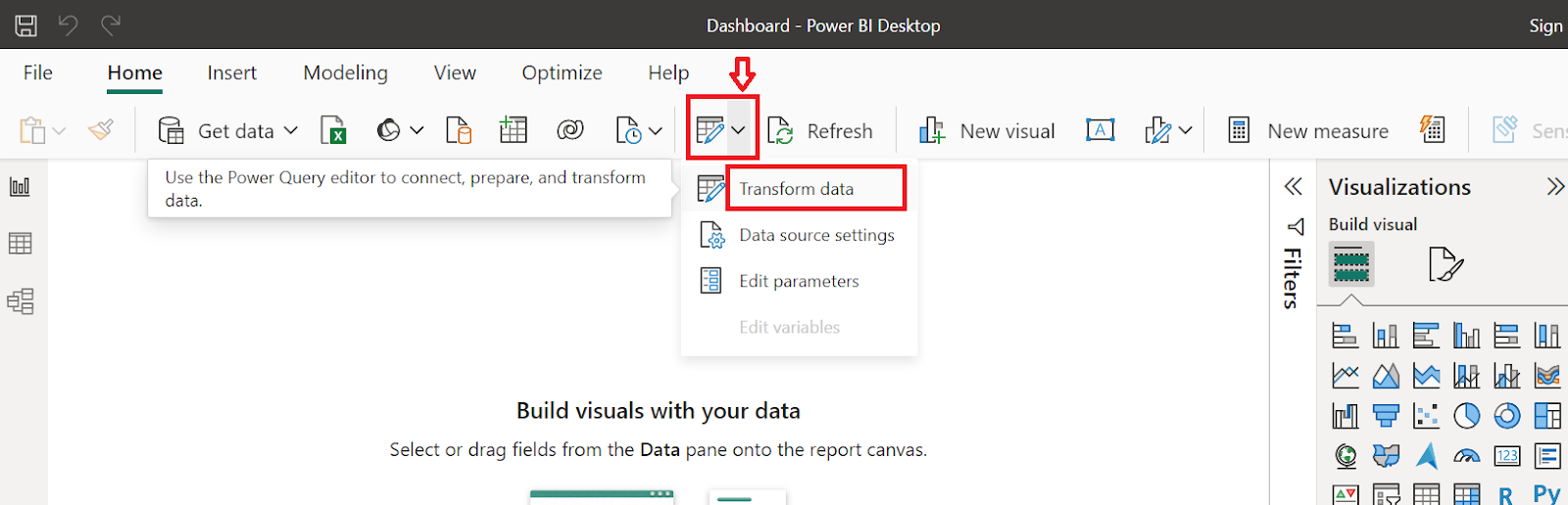
Data transformation is a process of changing the structure of your data or applying additional steps which will clean or process your data for final usage. We do these transformations in the Power Query Editor which is inbuilt into Power BI. To get to the Editor, we need to follow below steps:
- Go to the Report View
- Click on the drop down on the Transform data Icon
- You will see 3 Options, select the Transform Data option
Now for our purposes we will mainly see below steps:
- Renaming Columns
- Rearranging Columns
- Appending 2 Tables
- Replacing & trimming values
There are many other transformation steps which you can apply like Pivot/Unpivot, Merge, Filtering etc. but for now we only need the above 3 steps. Let’s go!
Renaming Columns
While studying the data, I noticed that the Specialty column in Inpatient data is named as Specialty_Name, whereas in Outpatient it is named as just Specialty. So we will rename the Outpatient column to match with the Inpatient data. Make sure to name it exactly the same, otherwise it will create an issue in following steps.
Rearranging Columns
We will now rearrange our columns of the outpatient so that it matches with inpatient. You can just left click on the column header and drag it to the required position. Now while rearranging, I noticed that we have an additional column in Inpatient i.e. Case_Type which is missing from Outpatient. So lets create one additional column in Outpatient table called Case_Type by
- Go to Add Columns
- Click on Custom Columns
- Name the column as Case_Type
- Enter the formula =”Outpatient”
- Remember to place this new column at the same position as inpatients
Appending Tables
Now that both our tables have the same column structure, we can safely append them together. To do that come to Home tab and click on “Append Queries” button and click on “Append Queries as New”. Select 1st table as inpatient and 2nd table as outpatient. Rename this new table as “All_Data”. Finally click on “Close & Apply”.
Appending Tables
Observe that Age_Profile & Time_Band columns have some redundant data, so first use the Replace function button in power query to clean the data, for eg: “18+ months” and “18 month +”, both are the same, so replace either one to match the other. Secondly there are some trailing blanks in values of these columns so remove trailing blanks by using the Trim function button.
Data Modelling
Data modelling is a way to create relationship with one table to another, so that we can fetch valuable information from them in our reporting layer.
Lets jump into the Data Modelling View, which is located at the left hand panel on Power BI. We will be using All_Data from now onwards, so we can safely hide inpatient and outpatient data. We can also stop it from loading into the data model by disabling it from the power query editor. Just right click on the table name in power query and uncheck Enable Load.
Now since specialty name is one of the key attributes that we are looking in this project, lets focus on that column now. As you have seen in the data, we have a huge number of specialty available and using all of them in our report layer directly will create a clutter in our visualization. A better approach would be to distribute them in buckets. So to do this I have created a specialty mapping file which you will find in the downloaded resources. Lets import that file in power bi to create the relationship with All_Data.
Once you import this file, Power BI should auto detect relationship and connect both the tables. However if it does not then you can do it manually by following below steps:
- Go to the model view
- Click on Specialty_Name column in All_Data
- Drag this column over the Specialty column in Mapping table
Now you should see a line connecting both the tables and an arrow pointing towards All_Data from Mapping table. This means that we have created a relationship between both the tables. The arrow signifies the filter context and tells you that now you can use columns from Mapping table to filter data in All_Data.
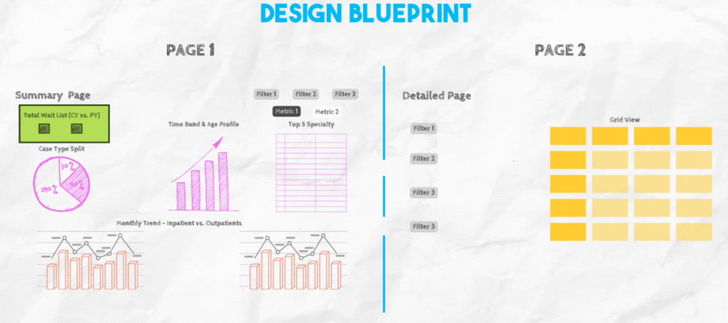
#4 Visualization Blueprint
For this exercise, I have already created a blueprint, however in live scenarios you will sit down with your team and create a wireframe of the required dashboard. You will then get this approved from the end stakeholder before starting your development activities.
#5 Dashboard Layout & Design
Before you start the designing process, I usually enable below two properties from the View tab. This helps me place and align my visuals in a uniform manner.
- Gridlines
- Snap to Grid
Now lets use DAX to create our measures which will be used in our visuals. For now we will create 2 measures for calculating Latest Month & Previous Year Wait List
Latest Month Wait List = CALCULATE(SUM(All_Data[Total]),All_Data[Archive_Date] = MAX(All_Data[Archive_Date])) + 0

PY Latest Month Wait List = CALCULATE(SUM(All_Data[Total]),All_Data[Archive_Date]= EDATE(MAX(All_Data[Archive_Date]),-12)) + 0
Now as per our design blueprint, insert these 2 measures in a card visual. After this create a blank table where we will store calculation method headers, i.e. in our dashboard we want to show Average values and Median values.
So enter a blank table from power bi and enter 2 row items manually i.e. Average & Median. Now with the newly created table create a button slicer, so that user can toggle between the two calculation.
Now create below measures which will help us get the calculation we need and also to make few chart titles dynamic
Median Wait List = MEDIAN(All_Data[Total])

Average Wait List = AVERAGE(All_Data[Total])

Avg/Med Wait List = SWITCH(VALUES('Calculation Method'[Calc Method]),"Average",[Average Wait List],"Median",[Median Wait List])

Dynamic Title = SWITCH(VALUES('Calculation Method'[Calc Method]),"Average","Key Indicators - Patient Wait List (Average)","Median","Key Indicators - Patient Wait List (Median)")

NoDataLeft = IF(ISBLANK(CALCULATE(SUM(All_Data[Total]),All_Data[Case_Type]<>"Outpatient")),"No data for selected criteria","")

NoDataRight = IF(ISBLANK(CALCULATE(SUM(All_Data[Total]),All_Data[Case_Type]="Outpatient")),"No data for selected criteria","")
Summary Page
Now place the charts based on our blueprint i.e doughnut, clustered column chart & top five Multi Row card. And remember to use the new measure which is Avg/Med Wait List in the values section.
Finally in the line chart at the bottom use Total column directly along with the Archive_Date. Remember to add a visual filter for Case_Type. So one chart will show Day Case & Inpatients and the other chart will show Outpatients. Add slicers for Archive_Date, Case_Type and Specialty.
Detailed View
Add a new page here add a matrix view using the Archive_Date, Specialty_Name, Age_Profile, Time_Bands, Case_Type and Total.
Tooltip Page
Create a new page which will be used as a tooltip. Add a chart to show Specialty and Total waitlist. Also add a card to show the Total sum of Wait List. Now set this page as tooltip by going to formatting >> Page Information >> Enable Allow Use as Tooltip
Now go back to summary page and select the line chart. General section of formatting, go to Tooltips and select the page i.e. the new tooltip page.
Beautify the Dashboard
This is very subjective but I usually go to Google or Adobe Stock website to draw inspiration. Once you have selected a dashboard as your inspiration. Go to Color.Adobe.com to extract the colors from your reference dashboard. Keep a note of these colors somewhere.
Now you can go to PowerPoint or Canva to design the background of your dashboard. You can play around as much as you like using the colors and different shapes. Once done extract your design as png file and use that image as a background for your Power BI canvas.
#6 Adding Interactivity
Now add interactivity in your dashboard like navigation buttons, chart alt display text and hovering info.
#7 & #8 Testing and Sharing
Ensure to conduct an extensive UAT session which will identify any bugs or data issues. After this you are ready to share your dashboard with a larger audience. Before sharing/publishing consider Row Level Security features within Power BI services. There is a detailed video on my Youtube channel, showing you how to setup the same.
#9 Routine Refresh & Maintenance
Hurraayyy, you work is finally done. You can now focus on implementing a BAU process to run monthly refresh process and maintenance.
Hope I was able to explain all these concepts in detail in my video. Stay tuned for more, thanks!
cool dashboard with useful tips. I find the toggle buttons very useful
Glad you liked the project 🙂
this project very use full my interview good explination bro
with this I got my first job very very helpful for my resume i had a career gap still found very good opportunity. Thanku so much sir I’m grateful!