Let’s say you have created a report with multiple charts and tables. In one of charts, you realize that, it will add a great deal of value, if you added an additional column or series representing a calculated field for e.g.: a cumulative sum or moving average. But the main catch here is that you don’t want to add that calculation to the semantic model because you are not going to use that calculated column in any other chart. So, which means using the traditional measures and calculated columns are not an option here. This is where the Visual Calculation feature of power bi comes to the rescue.
This is a new feature of power bi which was added in February 2024 and it is still in the preview feature. Today we will explore this new capability in detail and talk about its pros and cons. If you are interested then keep reading!
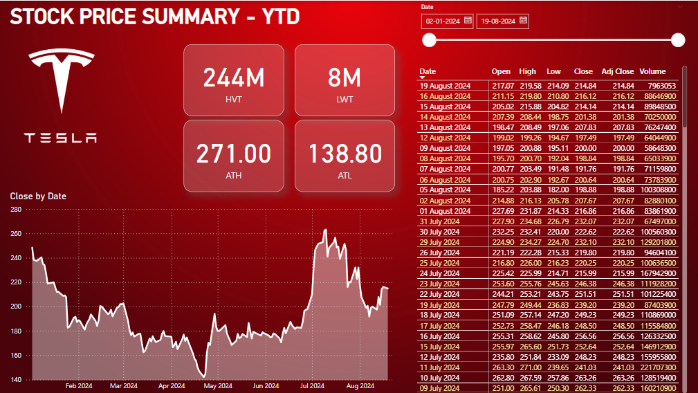
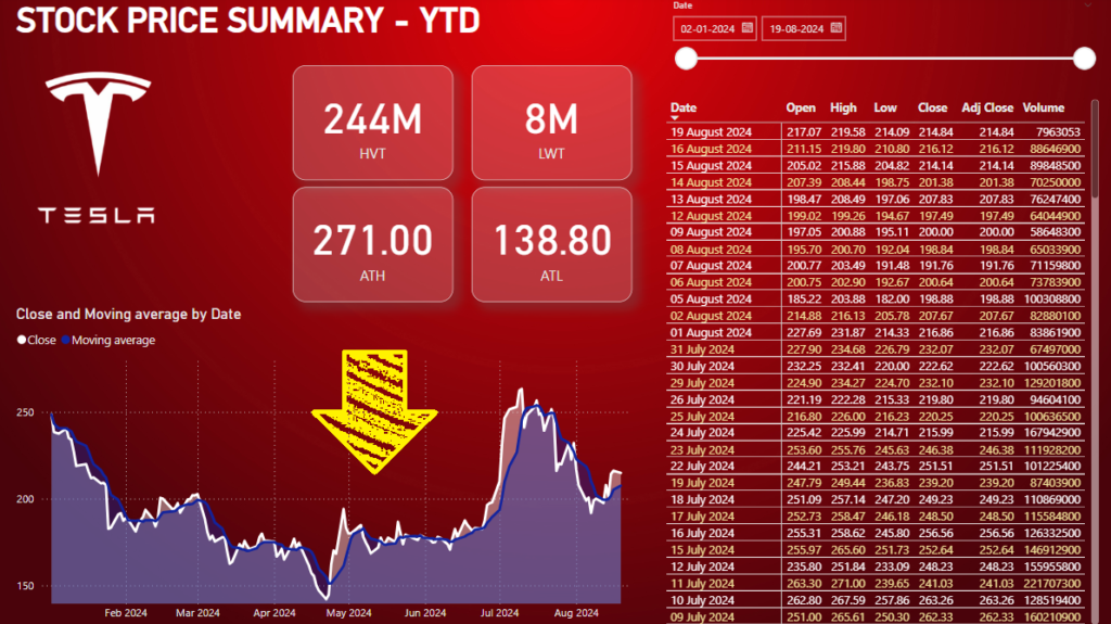
I have already created this basic report page, which analyses the stock prices of Tesla. We will use this to understand and implement Visual Calculations. You can download this file from the above download link.
What is Visual Calculation
For an average user of Power BI, learning DAX or writing complex DAX queries sometime becomes a daunting task. DAX are really powerful, but they can also be complex and time-consuming to write. You need to have a solid understanding of DAX syntax and logic to create effective measures. This often creates a barrier for those who aren’t data experts. But what if we had a visual way of picturizing your calculation and more importantly what if you had some pre-made formula templates which can be used to add some quick calculations like moving average or running total on to your visuals without even going into your data model. With Visual Calculations, it’s now as simple as a few clicks. This means faster insights and less time spent on setup.
Enable Visual Calculation
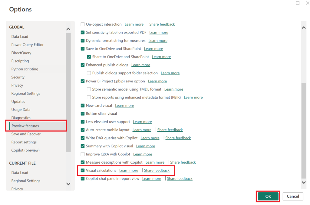
Before we get started, we need to enable Visual Calculations because as mentioned earlier, this feature is still in preview mode.
- Go to file and click on options & setting
- Click on options
- Select Preview Features
- Enable Visual Calculation check box
Visual Calculation Editor & Implementation
Now that Visual Calculations are enabled, it’s time to explore the interface and see what this new feature brings to the table. Let’s break down the Visual Calculations editor, explain how it works, and guide you through the core elements that make this tool so powerful.
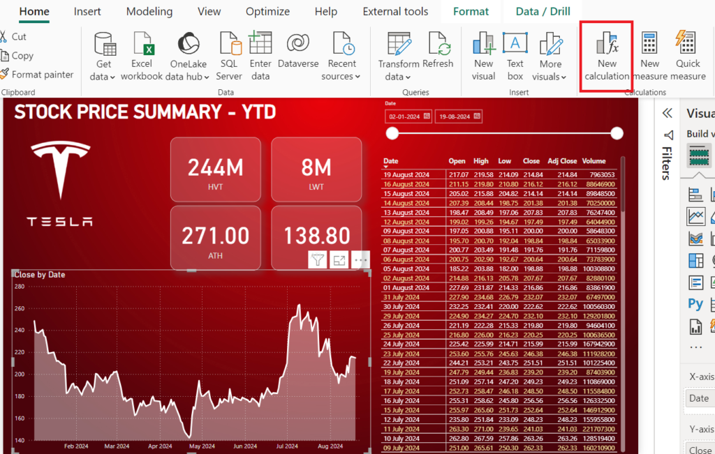
Start by selecting a visual where you want to apply a calculation. In this case let’s select this line chart at the bottom. Once you’ve selected your visual, you’ll notice a new button getting enabled in the Home ribbon i.e. New Calculation. This is the entry point for adding and managing your visual calculations. Click this button to open the Visual Calculation editor.
At first glance, it might remind you of the formula bar in Excel, but it’s tailored specifically for Power BI’s visual environment. Here, you can input your calculations directly, and they’ll be applied in real-time to the selected visual.
The editor supports a wide range of DAX functions, but the real beauty of Visual Calculations lies in its simplicity. For instance, let’s start with a basic calculation like
Close Running Sum = RUNNINGSUM([Close])As soon as you type this in and hit enter, you’ll see the visual update instantly to reflect the running total of your sales data.
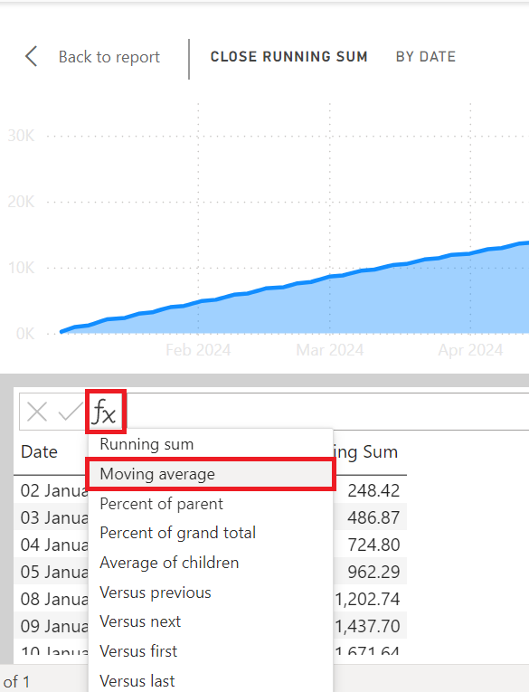
Alternatively, you can also click on the FX button to reveal all available quick formula templates. You can choose any of those formula templates and fill in your desired parameter. So for e.g. lets choose Moving Average. Now in this select field as Close and window size as 7 because we will be calculating 7 day moving average.
Moving average = MOVINGAVERAGE([Close], 7)Now although you have added Moving Average on your chart, but its still not properly visible against your Close figures because the Running Total numbers are too high. So in this case I would prefer hiding the Running Total calculation from my visual. For that just go to the Y axis section on your visualization panel and click on the eye icon on Running Total column to hide it. Since this is not deleting the column you can always come back and unhide it from the same place.
Now let’s see the chart outside of the editor. To do that click on the Back to Report button at the top left.
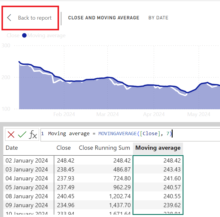
If you notice, with just few clicks we were able to add a very useful information to our line chart. Doing this the traditional way with measures or calculated columns would have take lot more time and would have to be included in our data model.
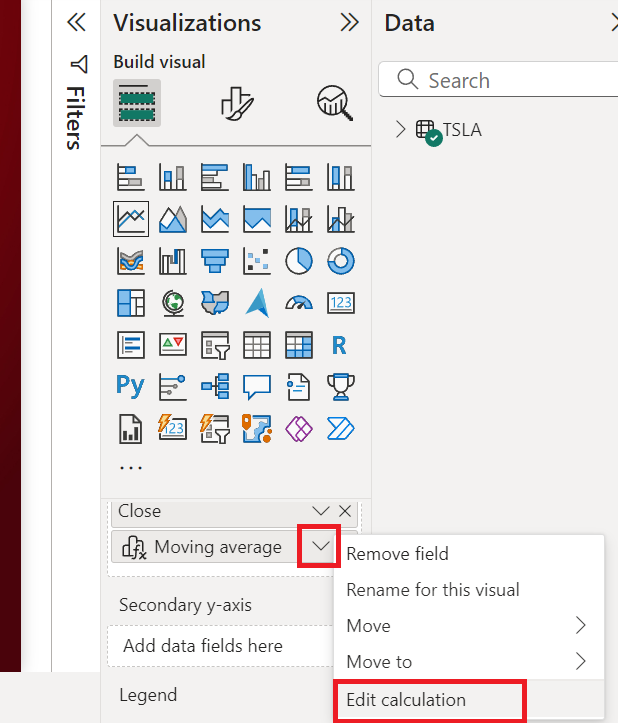
In case you want to edit the calculation that you just created then select the visual again and click on the down arrow against the new calculation you created inside the Y-Axis section. This will take you back to the Visual Calculation Editor window.
Now let’s look at few more examples of the readymade formula template and this time we will apply them on the Grid visual on the report. So go back to main report and select the grid visual and click on new calculation button. Just for simplicity we will focus all our calculations on just one column i.e. Close.
Similar to earlier, click on the Fx button to add:
- Percent of parent = DIVIDE([Close], COLLAPSE([Close], ROWS))
- Percent of grand total = DIVIDE([Close], COLLAPSEALL([Close], ROWS))
- Average of children = EXPAND(AVERAGE([Close]), ROWS)
Note: Percent of parent calculates the percentage of sub category total, while percent of grand total calculates the percentage of row again the final grand total.
Now because we are using Average numbers in this grid, the above function don’t really give any value. Instead we will use following functions to generate comparison with previous row, next row & last row.
- Versus previous = [Close] – PREVIOUS([Close])
- Versus next = [Close] – NEXT([Close])
- Versus last = [Close] – LAST([Close])
One final thing that I would like to show that along with the premade functions, we can also add custom functions. For e.g.: I can create a new column which will be difference between open & close column
Variance = [Open] - [Close]
Limitations & Best Practices
As powerful as Visual Calculations are, it’s important to understand their limitations to use them effectively. So, we’ll discuss some key constraints to keep in mind, as well as best practices to help you get the most out of this feature.
Here are a few limitations to be aware of:
- No Data Export: Data that’s calculated within a visual using Visual Calculations cannot be exported. This is because these calculations are dynamic and tied directly to the visual context, which doesn’t translate to a static export format.
- Formatting Restrictions: While Visual Calculations are powerful, they offer limited formatting options compared to traditional DAX measures. You might find that certain formatting features, like conditional formatting, are not as flexible when using Visual Calculations.
- Complexity in Multi-level Aggregations: If your analysis involves multiple layers of aggregation, Visual Calculations might not always provide the level of control you need. In such cases, you may need to revert to traditional DAX measures for more granular control.
Here are some best practices to keep in mind:
- Use Visual Calculations for Quick Analysis: They’re perfect for temporary calculations or when you need to explore data without cluttering your data model.
- Keep It Simple: The simpler the calculation, the faster your visuals will perform. Avoid overly complex calculations in Visual Calculations when possible.
- Combine with Traditional DAX: Use Visual Calculations alongside traditional DAX measures for more complex scenarios, allowing you to maintain performance and control.
- Monitor Visual Performance: Regularly check the performance of your visuals, especially when using large datasets, and adjust your calculations as needed to maintain a smooth user experience.
Visual Calculations are a fantastic addition to Power BI’s toolbox, offering new ways to interact with and analyze your data. But like any tool, knowing when and how to use them is key. By understanding their limitations and following best practices, you’ll be able to leverage this feature effectively without compromising on performance or flexibility.
That’s it, hope this content was helpful!
